

Color Psychology in Packaging: Choosing the Right Palette
Color Psychology in Packaging: Choosing the right palette
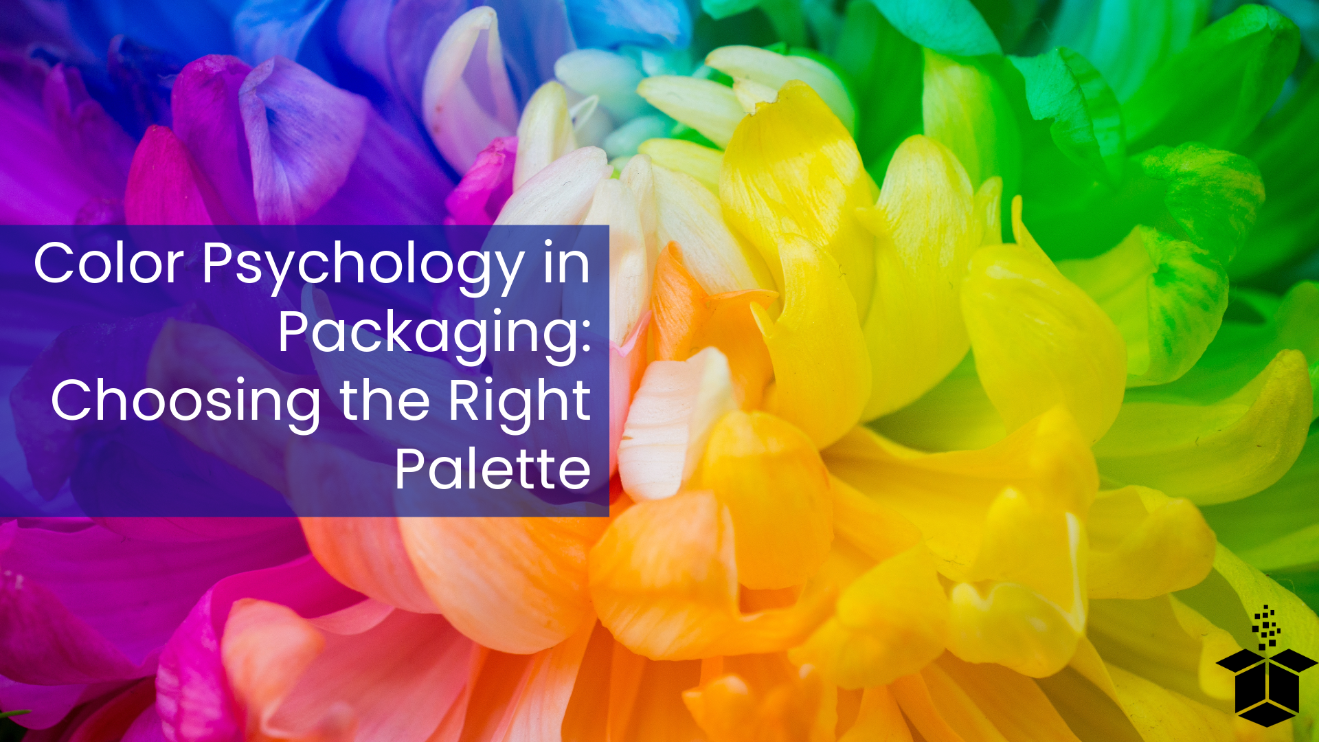
Did you know that colors play an important role in consumer decisions? Different colors evoke different emotions and different people lean to certain color palettes more than others. Being able to use color theory on your packaging can make your product stand out if you can evoke the right emotions from your packaging. Let’s explore the world of color theory to see how it can help make your brand stand out.
Color Selection
When it comes to packaging, color matters. No matter what position you are in, designer, buyer, producer, etc., understanding the psychology behind color is important. Here's why:
Emotional Impact: Different hues evoke specific emotions. For instance:
Red is associated with excitement, passion, and youthful zeal.
Blue can signify dependability, calmness, and trust.
Green is often associated with freshness, health, and eco-friendliness.
Yellow generally conveys optimism, energy, and warmth.
Purple usually suggests luxury, creativity, and sophistication.
Consumer Perception: Colors can shape how consumers perceive your brand. For example:
White: Symbolizes purity, simplicity, and cleanliness.
Black: Represents luxury, elegance, and sophistication.
Orange: Radiates enthusiasm, creativity, and affordability.
Brown: Conveys reliability, earthiness, and tradition.
2. Leveraging Color Associations
Understanding the meanings behind colors allows you to strategically use them in your packaging design. Here are some other insights:
Red is bold and attention-grabbing. It is ideal for promotions or urgent messages like clearance sales or limited-time offers.
Blue comes across as trustworthy and calming and suits products related to technology, healthcare, and financial services.
Green is a fresh and eco-friendly color as it appeals to health-conscious consumers and sustainable brands.
Yellow is energetic and cheerful and works well for products targeting youth or invoking positivity.
Purple gives off regality and imagination and usually suits luxury items or creative brands.
3. Industry-Specific Color Trends
Different industries have their color preferences:
Food and Beverages: Warm colors (red, orange) stimulate appetite, while green suggests freshness.
Cosmetics and Beauty: Soft pastels evoke femininity, while sleek black exudes elegance.
Technology: Clean white or minimalist gray conveys innovation and modernity.
Healthcare: Calming blues and greens create a sense of trust and well-being.
Color Theory Considerations
When thinking about color theory, there are some factors you should consider beyond emotion.
Who is your target audience and what are their preferences?
Who are you as a brand? What do you value?
Can the writing on your product be easily read? Make sure you are using colors that contrast enough to not blend.
With the world being so interconnected, be aware of the cultural meanings behind colors.
Remember, packaging color psychology isn't just about aesthetics; it's a powerful tool to connect with consumers and leave a lasting impression. So, choose your packaging colors wisely!
Source:
(1) Packaging colour psychology – how it affects your success. https://www.gwp.co.uk/guides/packaging-colour-psychology/.
(2) The Role of Color Psychology in Packaging Design - pandh.com. https://pandh.com/the-role-of-color-psychology-in-packaging-design/.
(3) A Comprehensive Guide to Choosing Packaging Colours. https://www.bizongo.com/blog/packaging-color-psychology.