

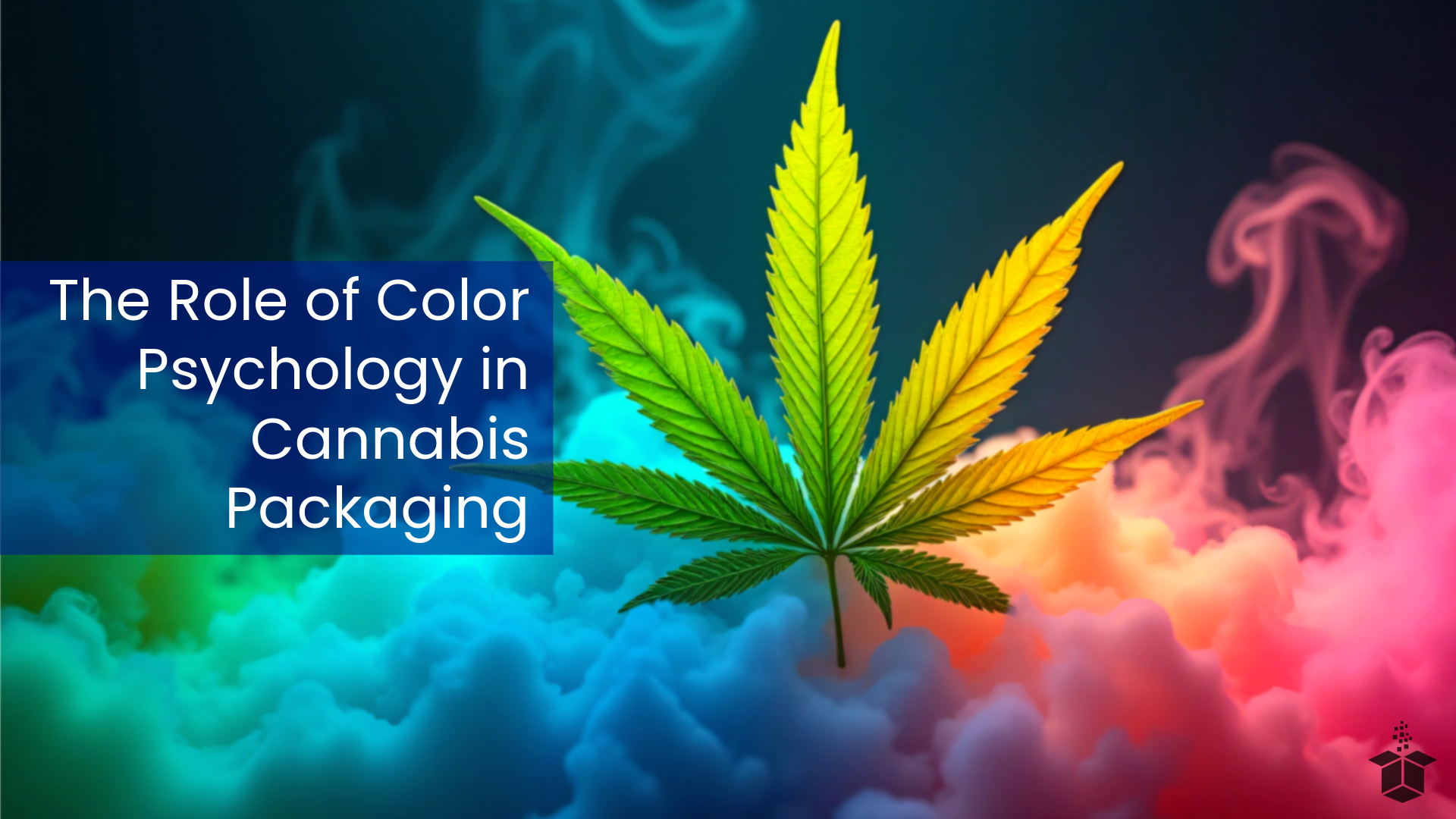
The Role of Color Psychology in Cannabis Packaging
Disclaimer: It is up to individual cannabis brands to know and keep up with regulatory requirements in their state or anywhere they sell their products. This post offers general guidance and creative ideas but is not a substitute for legal advice.
Among the many design elements that influence packaging, color stands out as one of the most powerful. The strategic use of color can evoke emotions, communicate brand identity, and influence purchasing decisions. This blog explores the role of color psychology in cannabis packaging, offering insights into how brands can leverage color to stand out in a crowded market.
The Science Behind Color Psychology
Color psychology studies how colors affect human behavior and perception. Certain colors evoke specific emotions and associations, which can vary based on cultural, personal, and contextual factors. For instance:
Red: Often associated with energy, passion, and excitement.
Blue: Conveys trust, calmness, and professionalism.
Green: Linked to nature, health, and sustainability.
Yellow: Represents happiness, optimism, and creativity.
Black: Suggests sophistication, luxury, and mystery.
These emotional triggers are not accidental. They result from both innate human reactions and learned cultural associations. For cannabis packaging, understanding these associations can guide brands in crafting designs that resonate with their target audience.
Why Color Matters in Cannabis Packaging
1. First Impressions and Shelf Appeal
In a retail setting, packaging is the first interaction a consumer has with a product. Bright, bold, or carefully curated colors can capture attention and make a product stand out among competitors. For cannabis brands, this is particularly important as the market continues to grow.

2. Brand Differentiation
Color is a key element in defining brand identity. For example, a brand focused on relaxation might use calming blues and greens, while a premium, high-end cannabis brand might opt for sleek black and gold packaging.
3. Consumer Perception of Quality
Color influences how consumers perceive the quality of a product. High-quality finishes combined with sophisticated color palettes can elevate a brand's perceived value, making consumers more willing to pay a premium price.
4. Regulatory Considerations
Cannabis packaging must adhere to strict legal requirements, which often include warnings and opaque designs. Despite these constraints, color can help brands comply while still maintaining an engaging and aesthetically pleasing package.
Decoding Popular Colors in Cannabis Packaging
Green: The Natural Connection
Green is almost always associated with cannabis due to its association with the plant itself. It conveys:
Health and Wellness: Brands targeting wellness-conscious consumers often use shades of green to signal natural and organic qualities.
Sustainability: Green reinforces eco-friendly and sustainable practices, a growing trend in cannabis packaging.
Calmness and Balance: Softer tones of green can evoke feelings of relaxation and serenity, aligning with products aimed at stress relief.
Brands can experiment with various shades of green, from vibrant lime tones to muted sage, to align with specific product attributes or target demographics. Pairing green with complementary colors like earthy browns or crisp whites can further emphasize the brand's natural and sustainable culture.

White: Minimalism and Purity
White is often used to signify cleanliness, purity, and simplicity. It works well for:
Medical Cannabis: White packaging aligns with the clinical, pharmaceutical image often needed for medicinal products.
Luxury Brands: Combined with metallic accents, white exudes elegance and sophistication.
Transparency and Trust: White suggests openness and honesty, which can appeal to consumers looking for clear, pure products.
The versatility of white allows it to serve as a blank canvas that highlights other design elements. When paired with subtle textures or embossing, white can create an understated yet powerful aesthetic that elevates the overall perception of the product.
Black: Elegance and Mystery
Black is a dominant color in any premium packaging, symbolizing sophistication and exclusivity. It appeals to:
High-End Consumers: Black packaging often includes gold or silver highlights to create a luxurious feel.
Mystery and Curiosity: The use of black can also create intrigue, drawing consumers to learn more about the product.
Professionalism and Authority: Black can communicate a sense of confidence and expertise, making it a popular choice for brands positioned as industry leaders.
Matte finishes, glossy accents, or textured details can enhance black packaging, adding depth and dimension. When combined with minimalist designs, black conveys a sense of modernity and class that resonates with discerning consumers.

Yellows and Oranges: Energy and Optimism
Yellow and orange are powerful colors for creating a sense of vibrancy and enthusiasm. In cannabis packaging, they can play several important roles:
Evoking Happiness: Yellow is often associated with joy, warmth, and positivity. It’s an ideal choice for products aimed at enhancing mood or promoting a sunny, uplifting experience.
Fostering Creativity: Orange combines the energy of red and the cheerfulness of yellow, making it a great choice for products marketed as inspiring or energizing.
Attracting Attention: Both yellow and orange are highly visible colors that stand out on shelves, ensuring the product catches the eye of consumers quickly.
Representing Citrus or Fruity Flavors: These colors are frequently used for products with citrus profiles, subtly hinting at the taste experience.
Appealing to Younger Audiences: These vibrant shades are particularly effective in targeting millennials and Gen Z, who often gravitate toward fun, dynamic, and lively branding.
By carefully balancing yellows and oranges with complementary tones, brands can ensure these colors evoke energy without overwhelming the overall design.

Earth Tones: Authenticity and Sustainability
Neutral colors like browns, beiges, and muted greens are ideal for:
Eco-Friendly Brands: Earth tones emphasize a commitment to sustainability and natural ingredients.
Handcrafted Appeal: These colors give the impression of artisanal, small-batch production.
Warmth and Comfort: Earth tones can create a grounding, welcoming aesthetic that resonates with consumers seeking a connection to nature.
Rich textures, such as kraft paper finishes or uncoated stock, can amplify the authenticity of earth-tone packaging. These colors work especially well for brands emphasizing organic or locally sourced products.

Blue: Trust and Tranquility
While not as common as green in cannabis packaging, blue has its place in conveying:
Reliability and Professionalism: Blue can suggest that a brand is trustworthy and dependable.
Relaxation: Softer shades of blue are associated with calmness, making them suitable for products aimed at sleep or stress relief.
Innovation: Vibrant or electric blues can convey modernity and forward-thinking, appealing to tech-savvy consumers.
To maximize the impact of blue, brands can pair it with complementary colors like white or silver to maintain a clean and polished look. Gradient effects or metallic finishes can also add a contemporary touch to blue packaging.

Purple: Luxury and Creativity
Purple has a long history of association with royalty and sophistication. In cannabis packaging, it is used to:
Highlight Premium Products: Darker shades of purple convey opulence and exclusivity.
Stimulate Creativity: Brighter purples can evoke imagination and playfulness, appealing to artistic or recreational users.
Layering purple with metallic gold or silver accents can enhance its luxurious appeal. For brands targeting creative users, combining purple with vibrant colors like teal or magenta can produce striking, energetic designs.

Creating Emotional Connections Through Color
Target Audience Segmentation
Understanding the preferences of different consumer demographics is essential. For example:
Medical Patients: Prefer clean, subdued colors like white and green that convey trust and professionalism.
Recreational Users: Respond to bold and vibrant colors that suggest fun and creativity.
Premium Buyers: Gravitate towards darker, richer tones that exude luxury and exclusivity.
Cultural Sensitivity
Color associations can vary across cultures. Cannabis brands with international aspirations must account for these nuances in their packaging design.
The Future of Color in Cannabis Packaging
Emerging Trends

Holographic and Iridescent Effects: These futuristic finishes add a modern twist and appeal to younger consumers.
Monochromatic Designs: Simple, single-color packaging can create a strong brand identity while standing out on crowded shelves.
Sustainable Inks and Dyes: As sustainability remains a top priority, expect to see more eco-friendly printing solutions.
Technology Integration
Colors combined with interactive elements like QR codes or NFC tags can enhance the customer experience. For instance:
Educational Content: QR codes linked to videos explaining the benefits of certain strains.
Augmented Reality (AR): Packaging that changes colors or reveals hidden messages through AR apps.
Tips for Designing Cannabis Packaging with Color Psychology
Know Your Audience: Conduct market research to understand your target demographic’s preferences.
Test Your Palette: Use focus groups or A/B testing to determine which colors resonate most with consumers.
Balance Creativity and Compliance: Ensure that your color choices adhere to legal requirements while maintaining visual appeal.
Consider the Product Form: Different products may require different color strategies to highlight their unique attributes.
Stay Consistent: Maintain a cohesive color palette across all branding elements to reinforce brand identity.
Conclusion
The role of color psychology in cannabis packaging cannot be overstated. From influencing consumer emotions to reinforcing brand values, the right colors can elevate a brand’s market presence and foster deeper connections with its audience. As the cannabis industry continues to evolve, brands that prioritize thoughtful and strategic use of color will be well-positioned to thrive.
Whether your goal is to exude luxury, highlight sustainability, or attract a younger audience, color is a versatile and essential tool in the packaging arsenal. By understanding and leveraging the principles of color psychology, cannabis brands can create packaging that not only looks great but also drives consumer engagement and loyalty.